20080229
Enta Meen?
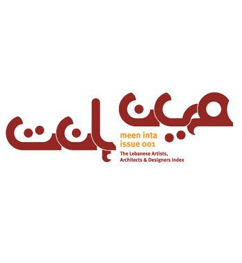
Meen Inta is a logotype produced for a series of flyers/posters about Lebanese artists/designers by Pascal Zogbi.
Zoghbi explains, "The main shape started from a question mark symbol (?). It is a rounded and based on a circular grid. The logotype is composed of detached Arabic letters; but at the same time, the letters are connecting and looping together. The logotype gives the feel of a maze or the feel of questioning. That is due to the fact that the flyers/posters main concept is to make the viewer ask who is this artist or designer who is introduced."
20080222
20080220
Skyscraper of Love
Discovered a talented UK based artist while surfing...Had to post one of his work...It is called 'skyscraper of love'. He has also been commissioned for Onyx a publication in Dubai. Funny work specially the loan ones' with dollar signs and the one with two emirate lookalike 'speaking, living breathing' mobile [phones].
You can check the rest at his site craig atkinson dot co dot uk---It's goooodd!!
20080216
A Beautiful Mess
Craig Ward is a London-based designer and illustrator who likes playing with words...
Sirdab recommends words are pictures
20080210
BEIRUT STREET GRAPHICS
copyrighted material- photography by Ghada Azzi
Streets are vibrant, budding, exuberant, colourful if not chaotic places where an unexpected rendezvous is often awaiting us around the corner. Its imagery [made of graphics, signs, advertisements, tags, graffiti...] offer one mishmash of colours like no other; street art composes a public gallery of icons, marks and references that reflects cities' personality.
Featured in this post, images I shot while wandering aimlessly in my city trying to dig Beirut's rock ... Needless to say that Beirut's graphic street culture speaks for itself...
Beirut is Vibrant, Beirut is Chaotic, Beirut is Crazy. Beirut is Bloody Charming...
I'll be posting many visuals of such, along with some links of buddies who have chosen to discover the heart, the soul of their city by screening its walls. Here, can't but think of a friend, Tarek Chémaly who has dubbed his "errance" thru Beirut, 'Murs-Murs' de la Ville {in French in the text--which is a play on word as murmure means whisper and Mur means wall too; Ville-City}.
To be continued.. Tarek has an archive of amazing imagery of Beirut's graphic language, and has written an excellent article in ArabAd magazine November issue 07... Will be posting some excerpts too...
Meanwhile, enjoy an ephemeral art by unknown but not unnoticed artists, who have decided to scribble, tag, salute the world; they have graphed messages that are often deeper than it looks!!
20080209
Around the world Helvetica is Helvetica
Falvay Borbala was among the selected designers whose posters got the Honorary mention
from Linotype Helvetica Now Poster design Competition. And here at Sirdab, we like this poster very much.
20080203
Lebanese Jamal Issawi scoops 3rd place
Helvetica NOW Poster Contest
2007 was HELVETICA’s 50th birthday.
Throughout the summer of 2007, Linotype put out the call for posters created with the Helvetica typeface.
And ArabAd had a long feature on the a half-decade history of the font.
Hundreds of entries were submitted; visitors to Linotype.com were able to vote for their favorite designs.
Now the Winners are out!!
& Guess What?
the 3rd Winner is a Lebanese national!! Isn’t that Absolutely Wonderful??
3rd Place:
“Today”
Jamal Issawi, Lebanon
2nd Place:
“hel()v(s)et(h)icA(s) or hell vs ethics”
Alexandre Rola, Portugal
“hel()v(s)et(h)icA(s) or hell vs ethics”
Alexandre Rola, Portugal
1st Place:
“Bread-and-Butter-Type”
Nina Hardwig, Germany
Loaded below are our favourite [actually the Lebanese participants who made it in the 30 best line-up;
but you check can all Top 30 Posters displayed at Lino.
Click Here
#5:
Jamal Issawi
#8:
Nanor Ghazar
#9:
Nanor Ghazar
#14:
Nanor Ghazar
#17:
Nanor Ghazar
#29:
Jamal Issawi
Linotype also, rewarded some designs that didn’t make it to the final;
however, as encouragement for several posters that showed
great typographic know-how, wit, and a strong conceptual level,
a special honourary mention was given to the designs that deserved it.
Here is our favourite
Click here to view all
20080202
Heart Beat
A German national, Monika Aichele is an awarded illustrator and graphic designer based in Berlin.
Her art works, regularly appear in publications worldwide.
We are fond of her style, which we find delightful and 'grafiklicious'.
We are charmed...
Her art works, regularly appear in publications worldwide.
We are fond of her style, which we find delightful and 'grafiklicious'.
We are charmed...
Things I have learned in my Life So Far...
'Things I Have Learned In My Life So Far' is an interactive exhibition by Stefan Sagmeister that opened at
Deitch Projects on January 31, 2008, in New York.
The exhibition includes works that have a life of their own, transforming throughout the exhibition as viewers engage with them.
Sagmeister’s illustrious career, as he is one of today’s most innovative and influential graphic designers.
His conception and application of graphic design goes above and beyond traditional notions of the practice, taking it to the realm of performative and conceptual art, painting and sculpture.
Things I Have Learned In My Life So Far is timed to coincide with the release of a new book of the same title, which surveys Sagmeister’s illustrious career, and is set to be released in Marcvh 2008.
Subscribe to:
Posts (Atom)