Showing posts with label typography. Show all posts

20090218

Bad Typography is Everywhere, says Craig


Sirdab has, for some while now, spotted this artist. Since then, we've been fervent admirer of London based illustrator, Craig Ward, posting several brilliant stuff made available on his online space dubbed 'Words are Pictures.'
Here is a sample from Ward's latest type-based design expressions.
As brilliant as we got used to! A true delight!!


20081006

Be there comrade


Four poster execution aesthetically enhanced by a great use of typography for the Beluga Bar of Mumbai's Intercontinental Hotel, India; this copy-based campaign has been conceptualised and designed by IBD Hakuhudo Percept, Mumbai.
The ads seem to target the yuppie new Indian elite who love to play the "gauche caviar" card, but with money to spend, who cares about politics!
To paraphrase the popular 80s show "lifestyles of the rich and famous" motto "Vodka wishes and caviar dreams!"

The copy reads:

"The Vodka and Caviar Evenings. From 22nd August - 30th Sept, '08.
At Beluga. Be there comrade."

20080927

Imagination awakened


Wonderful type design by another talented bubbler from the Redbubble dot community, named Natalie Tyler, a British national who says ♥ ing design and illustration and always up for a good t-shirt challenge to push her out of her comfort zone.
Check more of his graphic design expressions here

20080720

ashekman


ashekman
Originally uploaded by Sugarpoppy
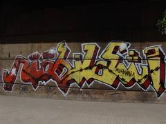
graffiti work from Beirut...good stuff!!

20080303

K


Typographic work by San Francisco based artist Tauba Auerbach.
Implied in her work is the notion that the conversion process is inexact. Her focus on language is a focus on the space between individuals, the gap they attempt to cross to meet one another intellectually and emotionally, and the nature of the tools they use to do so.
Her analysis includes a substantive examination of words, and a deep formal meditation on individual letters.
And Sirdab finds her work brilliant.


20080229

Ferme ta Gueule


By Gilles Dupuis a statement by Jean-Louis Barrault


Enta Meen?


Meen Inta is a logotype produced for a series of flyers/posters about Lebanese artists/designers by Pascal Zogbi.
Zoghbi explains, "The main shape started from a question mark symbol (?). It is a rounded and based on a circular grid. The logotype is composed of detached Arabic letters; but at the same time, the letters are connecting and looping together. The logotype gives the feel of a maze or the feel of questioning. That is due to the fact that the flyers/posters main concept is to make the viewer ask who is this artist or designer who is introduced."

20080216

A Beautiful Mess

Craig Ward is a London-based designer and illustrator who likes playing with words...
Sirdab recommends words are pictures


20080209

Around the world Helvetica is Helvetica


Falvay Borbala was among the selected designers whose posters got the Honorary mention
from Linotype Helvetica Now Poster design Competition. And here at Sirdab, we like this poster very much.


20080203

Lebanese Jamal Issawi scoops 3rd place

Helvetica NOW Poster Contest
2007 was HELVETICA’s 50th birthday.

Throughout the summer of 2007, Linotype put out the call for posters created with the Helvetica typeface.
And ArabAd had a long feature on the a half-decade history of the font.
Hundreds of entries were submitted; visitors to Linotype.com were able to vote for their favorite designs.
Now the Winners are out!!
& Guess What?
the 3rd Winner is a Lebanese national!! Isn’t that Absolutely Wonderful??


3rd Place:
“Today”
Jamal Issawi, Lebanon


2nd Place:
“hel()v(s)et(h)icA(s) or hell vs ethics”
Alexandre Rola, Portugal


1st Place:
“Bread-and-Butter-Type”
Nina Hardwig, Germany


Loaded below are our favourite [actually the Lebanese participants who made it in the 30 best line-up;
but you check can all Top 30 Posters displayed at Lino.
Click Here


#5:
Jamal Issawi


#8:
Nanor Ghazar


#9:
Nanor Ghazar
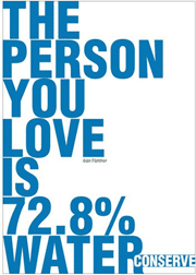

#14:
Nanor Ghazar


#17:
Nanor Ghazar


#29:
Jamal Issawi


Linotype also, rewarded some designs that didn’t make it to the final;
however, as encouragement for several posters that showed
great typographic know-how, wit, and a strong conceptual level,
a special honourary mention was given to the designs that deserved it.
Here is our favourite


Click here to view all


20080127

Read between the lines


Described as one of the five "best-read national conservative bloggers", Michelle Malkin, columnist, author, and Fox News contributor is frequently used as an example of the blurred line between bloggers and reporters. But this post isn't about her personally, rather about a funny initiative she took last year.
Back in November 07, when Arianna Huffington in association with GMM Rich Silverstein (the man behind the infamous 'Got Milk' ads who we nickname got milk man) launched The HufPo 'Posterizing the Modern GOP' project, Michell Malkin was obviously laughing.
The HuffPo project, aimed at "graphically capturing the lunacy of the Bush years," asked the blog readers to contribute by adding names, events, and slogans to Silverstein original Posters' design.
Malkin went on parodying the Huffington Post’s, 'Michelle style' as to say the least, as she launched with her own graphic art contest “Posterizing the Democrat Party.”
The result is interesting and proves once again that Design does matter!
Check the shortlisted posters on Malkin's blog and the see for yourself how they manage to graph socio-political points, each one his own way and tone.
Or buy the original stuff. 50 bucks for each poster; a silkscreen limited edition is also available, signed by Arianna Huffington herself, mind you!

Meanwhile, here in Lebanon, we should launch a similar graphic project to tackle the Lahoud bloody years or Aoun's wicked presidential ambitions. The list is unlimited as much as their apetite for power (was) is!!


20071228

Life full of Love


Exclusive work for sale from, London-based illustrator Von, at Shopvon.
His work is heavily influenced by the world of music, fashion and design, it is executed with a seamless blend of traditional and digital mark making techniques. The result being striking & insightfull illustrations with subtle narratives and a delicate and ethereal quality. Since establishing Hellovon early 06, Von's work has been exhibited internationally including the London Design Museum; his clients lists includes Ad agency Ogilvy & Mather, Dazed & Confused magazine, Wallpaper, The NY Times, the Guardian...

20071221

Jesus Save U


When type mixes with art, superstitions, formalities, religious affiliations and social behaviour the result is a vernacular way of expression. Lebanese trucks are filled with typographic sentences, some painted directly and others are vinyl letter shapes and illustrations stuck on any side of a moving truck.

Read More @ The Place Design

20071220

Brand Moss


Brand Moss has arrived... Her new identity was art directed by, a pivotal figure of British graphic design, Peter Saville also reputed for his work for music label The Factory; the logotype, spearheaded by Moss' modeling agency Storm, was designed in collaboration with typographer Paul Barnes--Barnes'typo design includes Bjork 'Pagan Poetry' single in 2003 and consultancy for the likes of Wallpaper, the Guardian, Harper's.
The Kate Moss Font ended up being a variation of the type Brodovitch Albro, used in issues of Harper's Bazaar from the 1930s, '40s, and '50s, which was created by Alexey Brodovitch, known for his art direction of the publication from 1938-58.
The model new identity is visible now in Topshop’s stores in the UK and on their website and will certainly expand in any endorsement Kate Moss may partake.

Read more in Creative Review

20071219

Homage to a typeface


Filled with pages of color images of Helvetica in use, from album covers and road signs to advertisements and product packaging, the designs gathered together in honor of Helvetica have been created by superb designers and anonymous amateurs from all over the world.
The result is an exciting collection of this icon of modern design.

Homage to a typeface, a book by Lars Muller

20071218

J M CA


Designed by Catherine Zask


Zask was born in Paris in 1961. She imbues her letters with an authority that is usually only conferred on images. It can trigger movements or echoes, affect the spaces in between the letters, store images... It's as confusing as point blank!


Afghanistan: where are you at?


Design by Catherine Zask


Catherine Zask counts among France's major graphic artists.
Her design work is distinguished by unusual typeface handling;
her typographical singular approach, always ends up creating an appropriate and comprehensible form for a statement.


Choisir


Designed by Urkurk